Est.2016
→
∞
Five Landing Page Fixes That Actually Move Conversion Rate
marketing
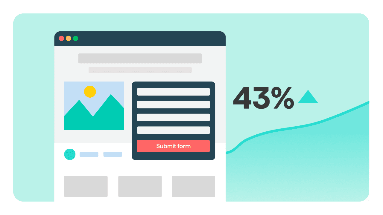
Conversion advice online is overwhelmingly about micro-optimisation — button colours, urgency timers, the exact wording of a call to action. For a book product page, these are almost never the constraint. The constraint is usually that the page does not answer the questions a buyer actually has before spending forty pounds on a physical object they cannot hold.
Here are the five that come up in nearly every page we audit.
1. Show the object, not the cover file
The most common failure on a publisher’s product page is a single flat cover render on a white background. That image tells a buyer the book exists. It does not tell them what they are buying.
Someone spending real money on a hardback wants to know: how big is it, how thick is it, what does the paper feel like, how are the images reproduced, is the binding sewn or glued. None of that is visible in a cover file.
Replace it with photographs. The book held in a hand for scale. Three or four spreads showing typical pages, including the densest ones. The spine and the edge of the block. Any foil, emboss, or special finish photographed at an angle where it is actually visible. If the book has good production values, this is the single highest-return change you can make, because production quality is the reason people pay your price rather than buying a print-on-demand competitor.
2. Put the specifications where they can be found
Format, dimensions in millimetres, page extent, number of illustrations, paper weight, binding type, ISBN, publication date. Not buried in a collapsed tab at the bottom of the page — visible near the price.
This looks like a detail. For specialist buyers it is a purchase criterion. A collector deciding between two books on the same subject is choosing on extent and reproduction quality, and if you do not state yours they will assume the worst.
3. Answer the shipping question before it is asked
The most common reason a specialist book order is abandoned is not price. It is discovering the shipping cost at checkout, or being unable to discover whether you ship to a particular country at all.
State shipping cost and rough delivery time on the product page itself. If you ship internationally, say so explicitly with a short list of regions and prices. If you do not ship somewhere, say that too — a clear no costs you one sale, an unanswered question costs you the trust of everyone who wondered.
4. Give the description a first line worth reading
Most publisher product pages open with a paragraph written for a catalogue: the author’s credentials, the scope of the work, a sentence about its contribution to the field. It is accurate, and nobody finishes it.
The first line has to do one job — tell a browsing reader what this book contains that they cannot get elsewhere. The specific archive that was opened. The interviews that were conducted. The photographs that have never been published. The catalogue paragraph can follow immediately afterwards for the people who are now reading properly.
5. Remove everything between the reader and the button
Look at the path from landing to purchase and count the interruptions. A newsletter popup at three seconds. A cookie banner covering the price. A related-titles carousel above the buy button. An account creation requirement at checkout.
Each of these has a defensible reason to exist and each of them costs conversions. The newsletter popup in particular is usually placed to interrupt the highest-intent traffic — people arriving from an ad you paid for. Delay it, trigger it on exit intent, or show it only to visitors who did not arrive from a paid campaign.
Guest checkout is worth singling out. Forcing account creation before purchase is the most reliably harmful thing on a small publisher’s checkout, and it exists on a surprising number of them.
How to know which one is your problem
Do not guess and do not fix all five at once. Install a session recording tool for two weeks and watch twenty recordings of people who did not buy. It is uncomfortable and it takes an hour, and it will tell you more than any amount of general advice, including this article.